Responsive Design: Reaching More People with Your Coaching Site
I was just blown away by my favorite theme, Canvas from WooThemes.
Let me explain “responsive design” in words before I show you in a video.
You see these days we’ve got quite a wide range of methods for viewing web page: phones, pads, laptops, desktops, tv’s and James Bond tuxedo shoes – and your website is likely to get seen on any and all of these.
As such, you need to ensure that your site looks good on all of them – it fits properly in the viewing area with minimal resizing or scrolling.
And if your website does this well, then it’s “responsive”.
In this article I will tell you about the many benefits of responsive design, tell you a little about the Canvas theme for WordPress, and show you a video of how this theme “responds”.
You may be of the opinion, “Oh, my viewers will probably be at home on their laptop if they are at my site. I only need to make sure it looks good on my computer.” This is becoming more and more incorrect each day.
Let me give you a quick example of how easy it is for someone to end up at your site via their mobile phone.
A friend is on her iPad in Starbucks. She’s reading a blog she loves and the content instantly reminds her of you. She forwards the article to you by email. You get a ding on your iPhone while at a family picnic. Since it’s from her, you’re intrigued, and you click to the article.
Voila! You end up at some a website (could easily be a coach’s site) on your phone.
Here’s another reason to ensure your site is responsive – my stats.
I just looked at my website statistics. About 10% of visits to my site (CoachingSitesThatWork.com) were not from a computer (PC or Mac) but from a mobile device including pads. In number, that’s 180 visits over the last 30 days.
For me, that’s worth the time to ensure they are able to see my site properly across mediums.
True, I’ve been marketing for years and have a lot more traffic than the new coach. But let me just ask you, how many times have you gone on the Web or checked email on your handheld device today? This week?
Various other sources of web traffic stats from mobile devices are in the 10% range as well – and growing fast.
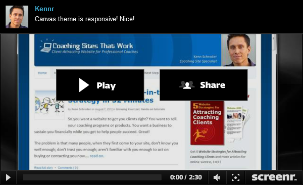
Now let me show you the WOW of responsive design in this video.
I was originally intent on ensuring my website looked good on computers, phones and pads. But when I started to play with Canvas …
About this theme, Canvas.
Canvas is one of WooThemes (a WordPress theme making company) top themes. The newest version, released June 2012, is fully responsive “out of the box” (without any customizing).
Up until this new version of Canvas, my solution for ensuring proper viewing on browsers and devices was a mix of several technologies which I’ll spare you the boring details.
As you now know, the primary benefit to you, a business owner, is that your site will look great to a maximum number of people – your market.
Here’s why Canvas is VERY good for me, a web developer:
- There are fewer bugs due to less “integration” work. Saves time.
- There is less time spent on updating since I won’t need the other software.
- I can build sites faster since there are fewer steps setting up.
- The sites I create run smoother since the responsive element is part of the core.
- Fixing bugs is faster since there is only one software provider to deal with.
For a developer like me, this is simply grand.
Besides being responsive, the top things I love about the Canvas theme are:
- You can customize easily – both designers and non-designers.
- It looks very good “out of the box”.
- It’s supported by WooThemes – fun, proactive, well-supported company.
In sum, Canvas’s responsive design is a great time saver for site builders and a great platform for delivering responsive design. Learn more about Canvas, click here and click on “Themes”.
Did you learn something new? Is your site responsive?
I’d love to hear from you.
Fantastic theme. I’ve just had a site created http://www.thesuccessfulbuilder.com and it is exciting to see it show up so well on different viewing platforms. The site is for builders and an increasing number of builders use smart phones for email, and tablets for viewing plans etc, So it makes sense to ensure the site is available for these devices. Maybe it might not be so necessary if it were aimed at desk bound people. But most builders hate being desk bound!